You may have noticed a slick new feature on AP that we call Clips. You can find the Clips section on the front page; it’s where we make small posts or simply ask all kinds of silly questions. It’s a space to interact with readers for content that doesn’t warrant a full post. Well, we recently asked everyone to share screenshots of their homescreen, and boy did y’all deliver. That Clip has over 600 comments and counting.
But this got me thinking: each and every screenshot looks different, our homescreens are indeed a digital representation of ourselves, unique in form and function, which not only speaks to how customizable Android is but easily reflects a little about ourselves. From minimal screens to shots that literally use every inch of real estate, the differing designs are endlessly complicated using our favorite launchers. But of course, we have our favorites, which is what this post is all about: sharing the cream of the crop with the very readers who went out of their way dropping hot homescreens in our comments. So here are our ten favorite homescreens y’all dared to share with us over the past weekend.
10 Make your homescreen look like a game
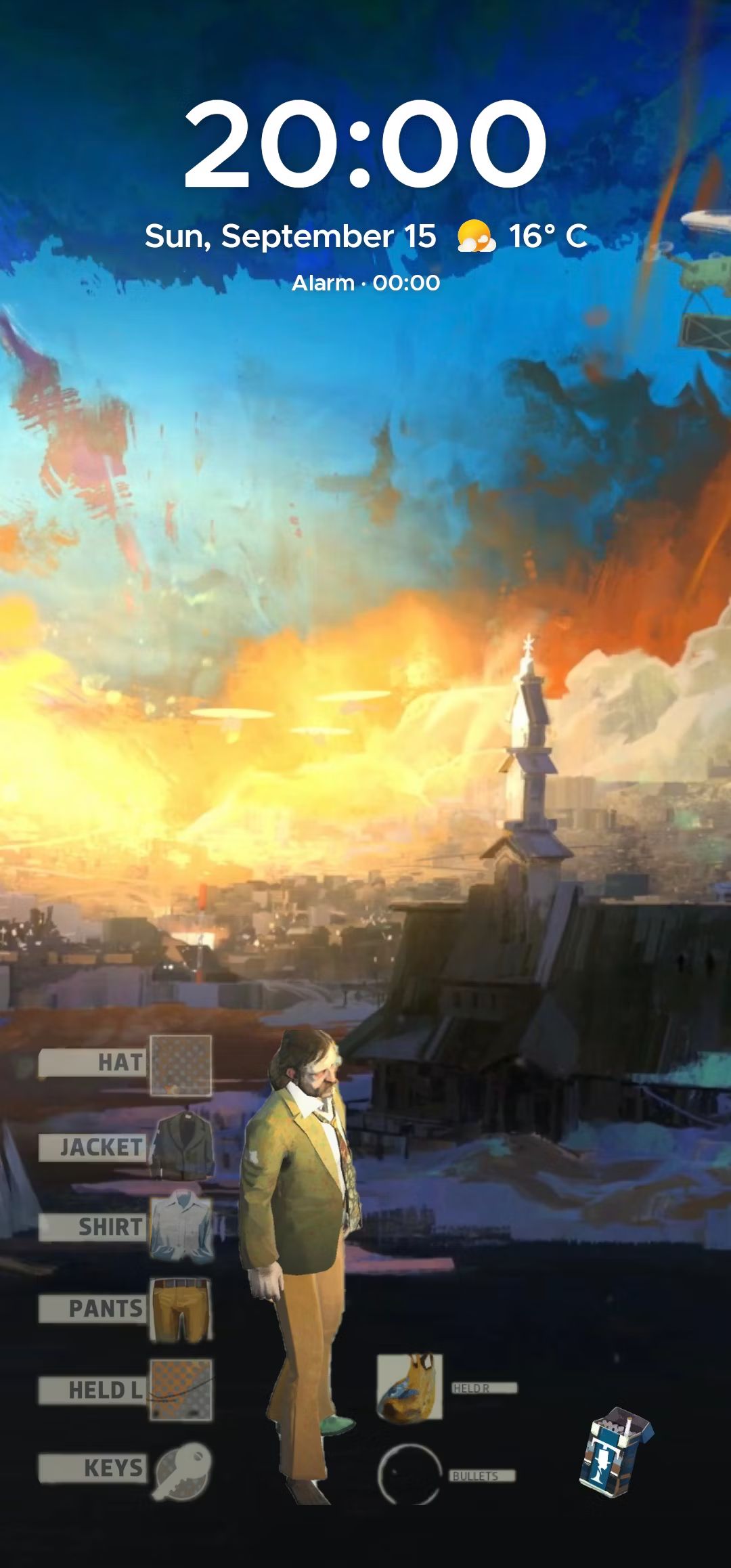
D’s Disco Elysium theme belongs in the RPG
Source: D
By combining Smart Launcher with KWGT, you get a homescreen that leans on the theme of Disco Elysium. Reader D’s screenshot looks like it belongs in the game itself. Toss a clock widget up top along with the weather with the help of KWGT, and you have some basic data, which is needed since the notification bar is hidden. It’s a simple setup, and thanks to those icons ripped straight from the game, you get a homescreen that looks like an item selection screen. So game on, D, and continue your gaming adventure; this homescreen is a winner.
9 Never leave your homescreen
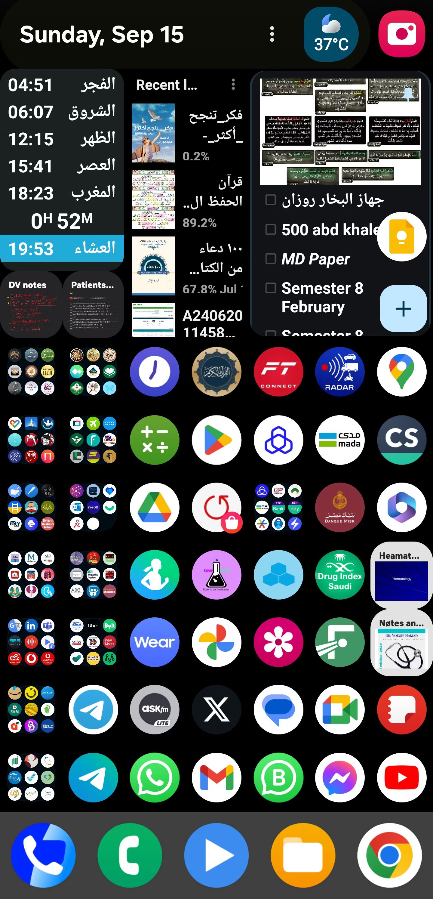
Dr. Mohamed has a prescription for you
Source: Dr. Mohamed
Clearly reader Dr. Mohamed themes to the beat of a different drum. Where minimal screens are found right and left, here we can see what happens when you toss everything you can onto your homescreen. Utilizing Nova Launcher, there is a top row of widgets for the date, weather, appointments, and tasks, with a slew of app icons and folders taking up the rest of the screen. Dr. Mohamed claims to be shooting for functionality here, and it’s hard to argue against having everything you need a tap away. So rock on, Dr. Mohamed. Your homescreen may not be a looker, but it sure is one that stands out, and for that, we here at AP applaud you.
8 Is that a folding phone in your pocket?
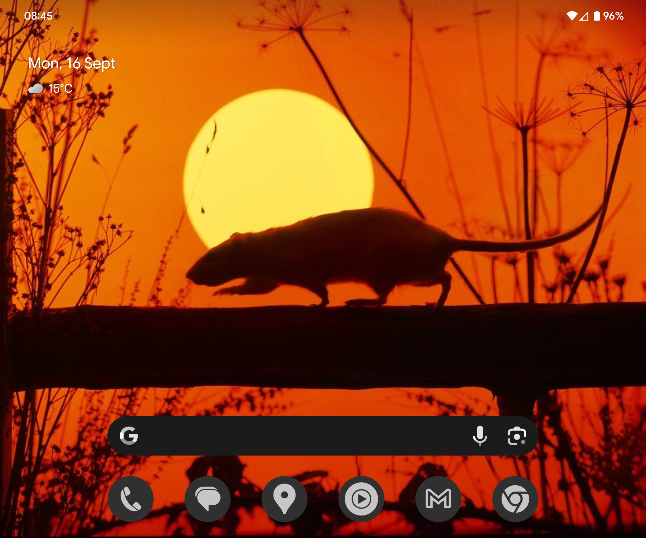
Michael’s Pixel Fold embraces the basics of the Pixel Launcher
Source: Michael
With so many ways to theme your device, sometimes the Pixel Launcher gets lost in the mix, but thanks to its ability to theme icons on the fly, not to mention how well it matches these icons to a wallpaper, we would be remiss to not include at least one screen that is utilizing Google’s launcher. Of course, the Pixel Fold offers extra screen space when unfolded, but Michael has skipped the clutter for something simple that allows the Pixel Launcher to shine. Sure, the wallpaper is a big ‘ol rat, but this contrast of a rat and clean theming makes for a striking screen, all by using what comes stock on the device (beyond the wallpaper). Michael is clearly the king of the rats, and AP is into it; nice stuff.
7 Nothing wrong with retro themes
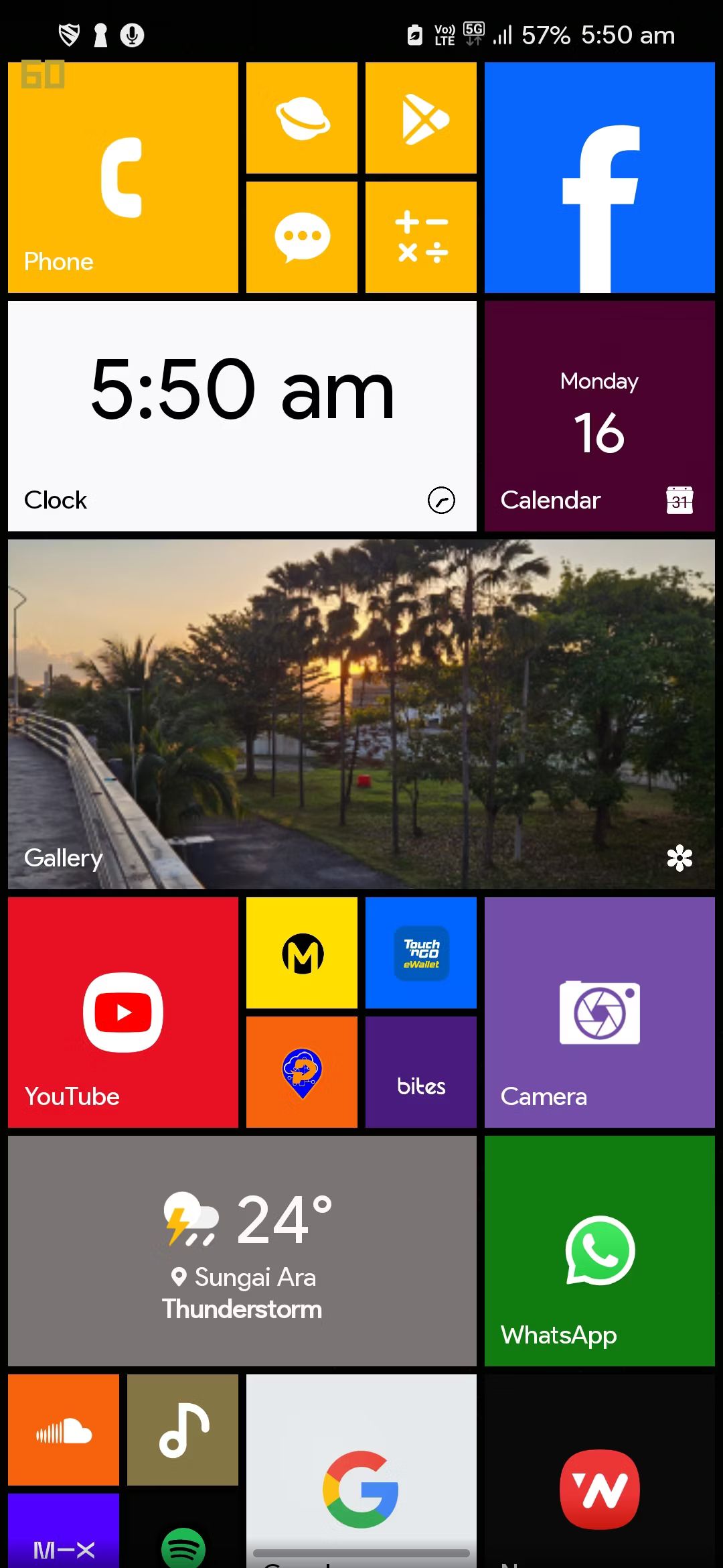
Andrew is living in the past with this Lumia theme
Source: Andrew
Do you remember Windows 10 Mobile? Sure, it wasn’t an Android operating system, but many of us at AP still miss the OS and the competition it brought, so it’s very understandable to have a soft spot for Metro UI. As a matter of fact, there are a few Android launchers that cater to Metro UI’s boxy theme, one of which is used here, known as Launcher 10. While the phone used is an S23, the homescreen sure looks like it belongs on an old Nokia Lumia. So not only does this homescreen offer a bunch of nostalgia, Microsoft was indeed onto something with the design, allowing for a large percentage of apps and widgets on a single screen, all the while looking great.
6 Sometimes, all you need is a list
Sandeep uses Niagara for a polished homescreen
Source: Sandeep
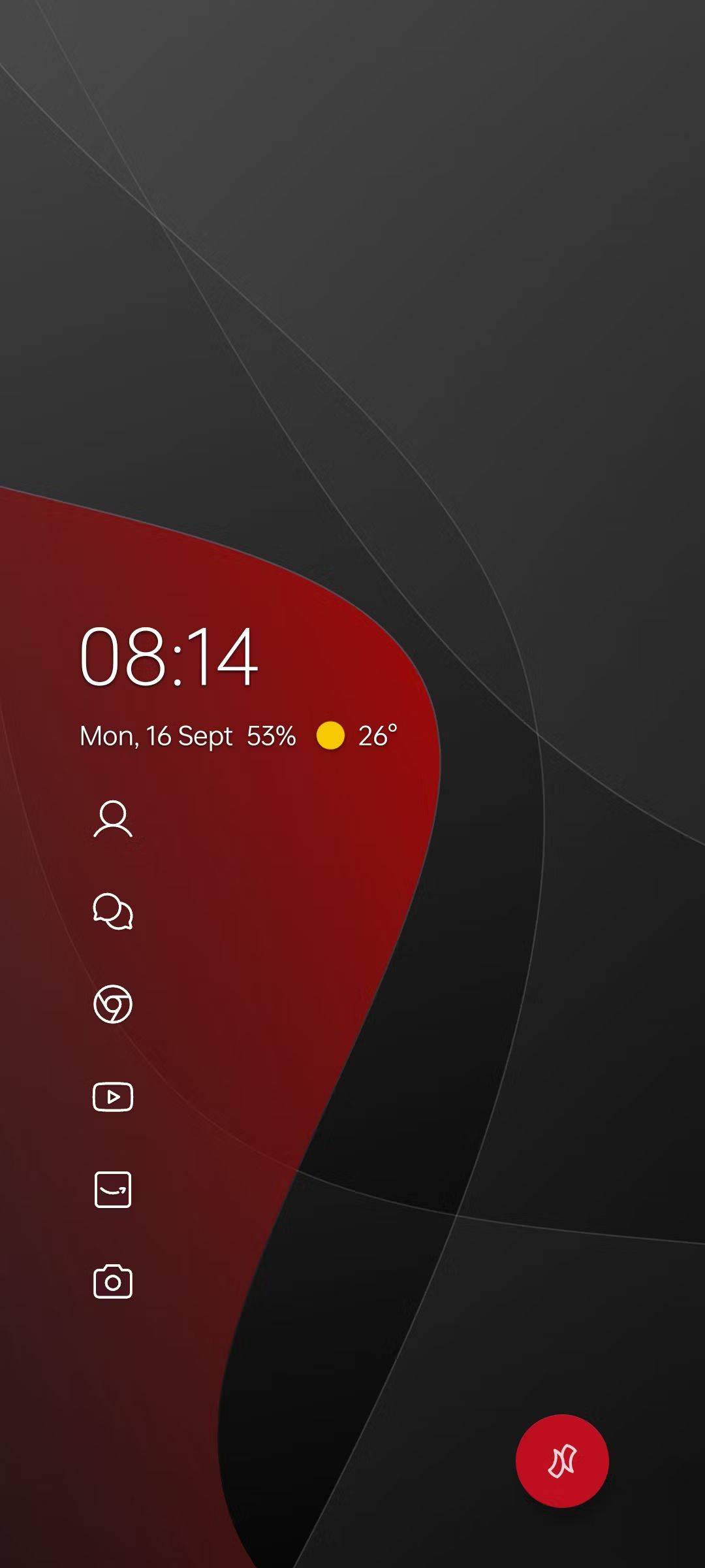
While there were a few homescreens clearly using Niagara Launcher, Sandeep’s theming stood above and beyond. Yes, this is a minimal theme, something the Niagara Launcher leans into with the way it displays apps in a list. But that is what’s so compelling about this setup: you can use the colors of your wallpaper to the device where your app list sits from the rest of the screen. Look closely at how all icons, along with the clock and weather widget, sit inside the red area of the screen. That’s slick. And sure, there is one lonely bright red icon in the lower right corner, but look how it pops. All in all, this is an attractive, minimal theme that uses Niagara to perfection.
5 Bright colors are often infectious
Dave provided this colorful homescreen
Source: Dave
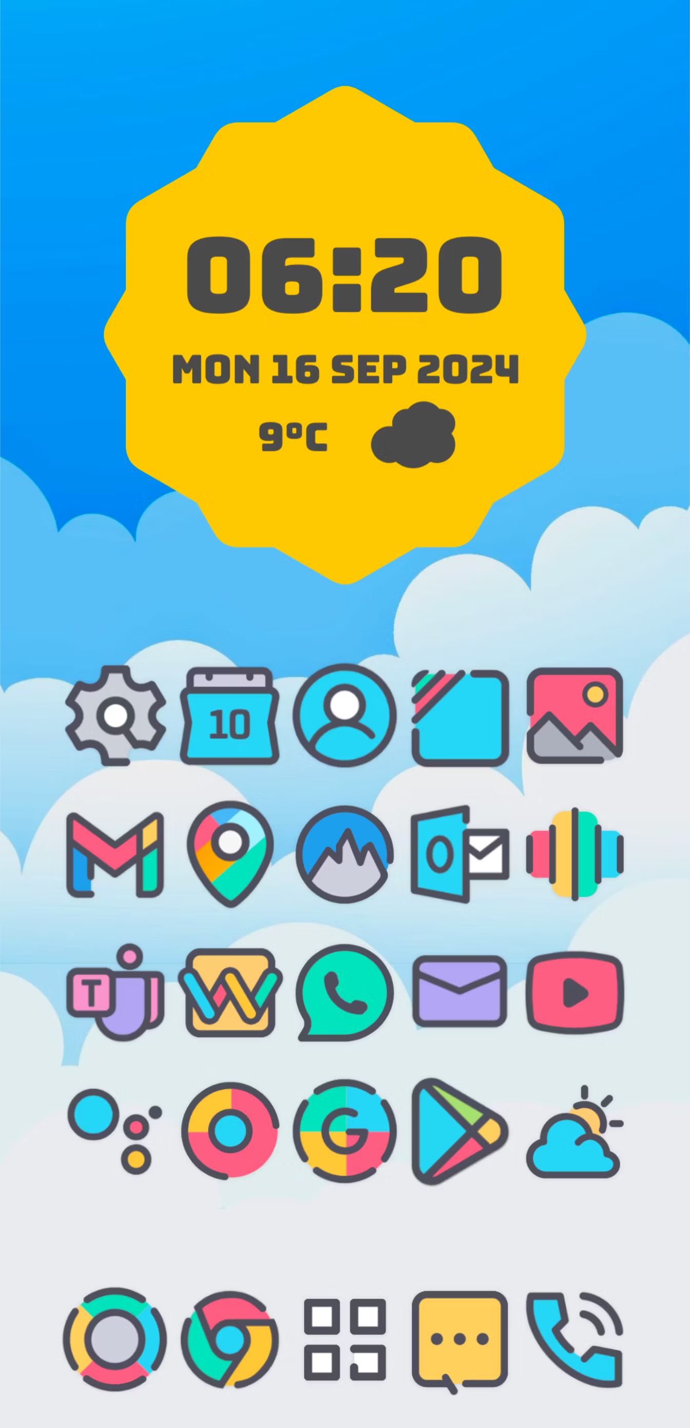
Many of us at AP love bright colors, and this screenshot offers plenty of pop, thanks to the use of the Crayon Icon Pack and You IconPack on top of a cartoony cloud sky wallpaper. The clock appears to be some kind of Android 13 style that Dave has customized, which you can easily emulate with Kustom Widget Maker and an Android 13 widget pack. Overall, this is a striking homescreen with hidden nav/notification bars, and with the way apps take up the majority of the room, you’ll rarely have to dip into the app drawer, making for a simple screen that looks great while providing plenty of functionality to jump into your favorite apps. Not too shabby.
4 Simple, simple, simple
Angie keeps things uncomplicated and beautiful
Source: Angie
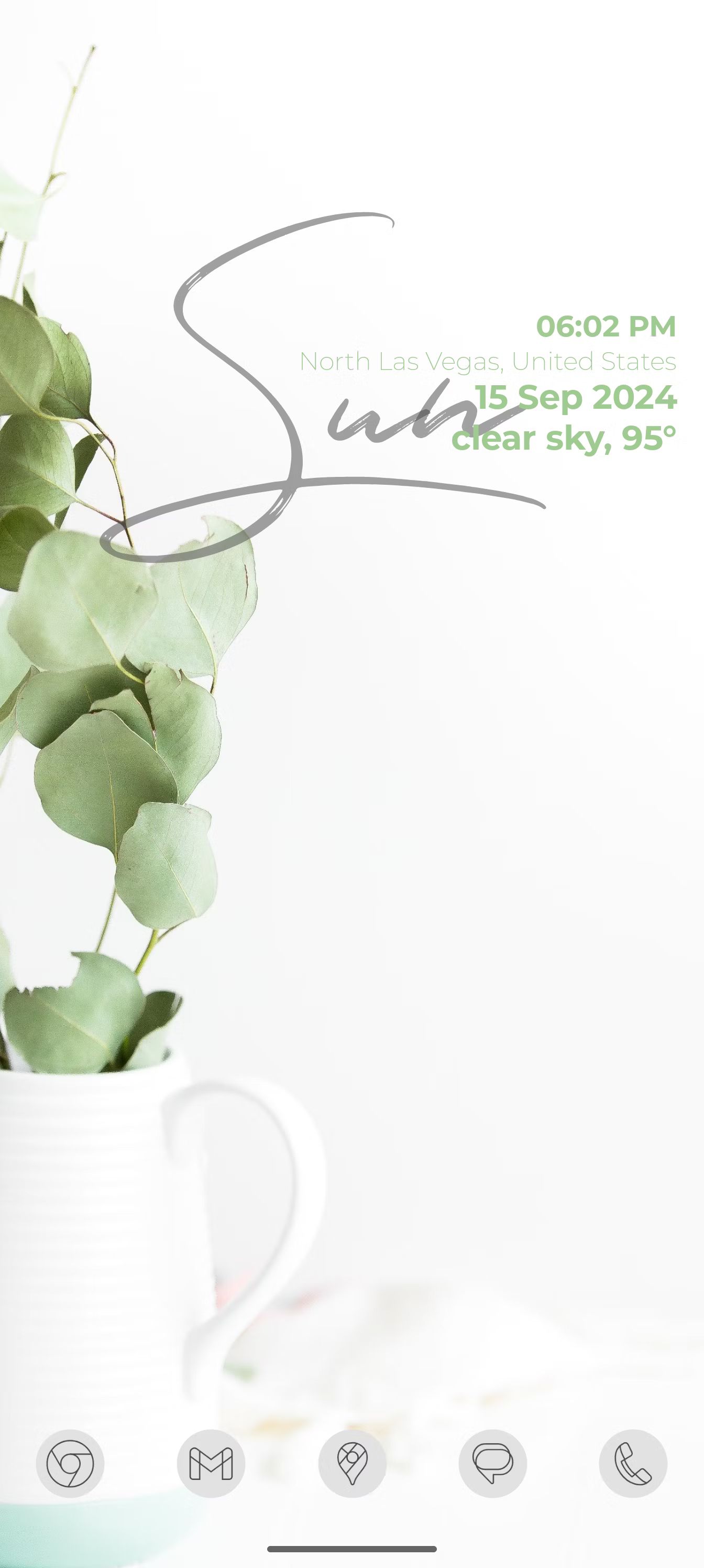
Here we can see Angie’s homescreen, and yes, it is minimal, but it sure makes an impression. Angie is using a Pixel 9 Pro with Nova launcher, combined with KWGT with the Timeless KWGT widget pack, paired with Arcticons Material You icons. So this simplicity took a few apps to accomplish its look, but it sure was worth it, as this is an elegant homescreen that is really eye-catching. The clock and weather widget are what really tie this whole thing together with the simple wallpaper, utilizing the few colors found on the screen for a theme that matches impeccably.
3 Clean lines on a black background couldn’t be more striking
Reader silvervulpes comes out swinging
Source: silvervulpes
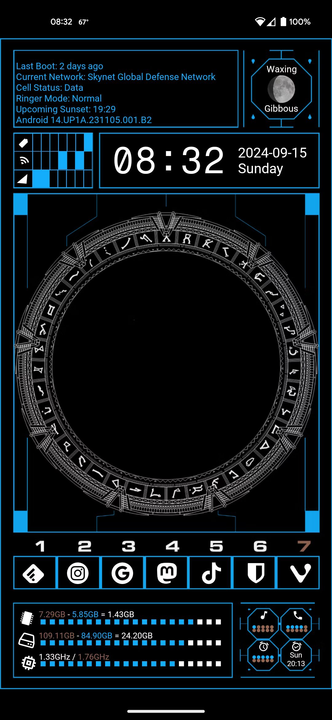
Reader silvervulpes dropped this beauty with very little info, so how it was created remains a mystery, but there is no denying it’s very striking. What’s really incredible about this setup is that it only makes use of three colors: blue, white, and black, and the use of the black background to make the blue lines and white icons pop speaks for itself. Of course, silvervulpes claims this homescreen took a while to create, but there is absolutely no denying the result, that time spent was well worth it. Not only are there several handy app shortcuts, but the amount of data provided on one screen, from the phase of the moon to the last time the phone was booted, should really please the themer in us all.
2 Minimal to the max
Pratik takes minimalism to the extreme
Source: Pratik
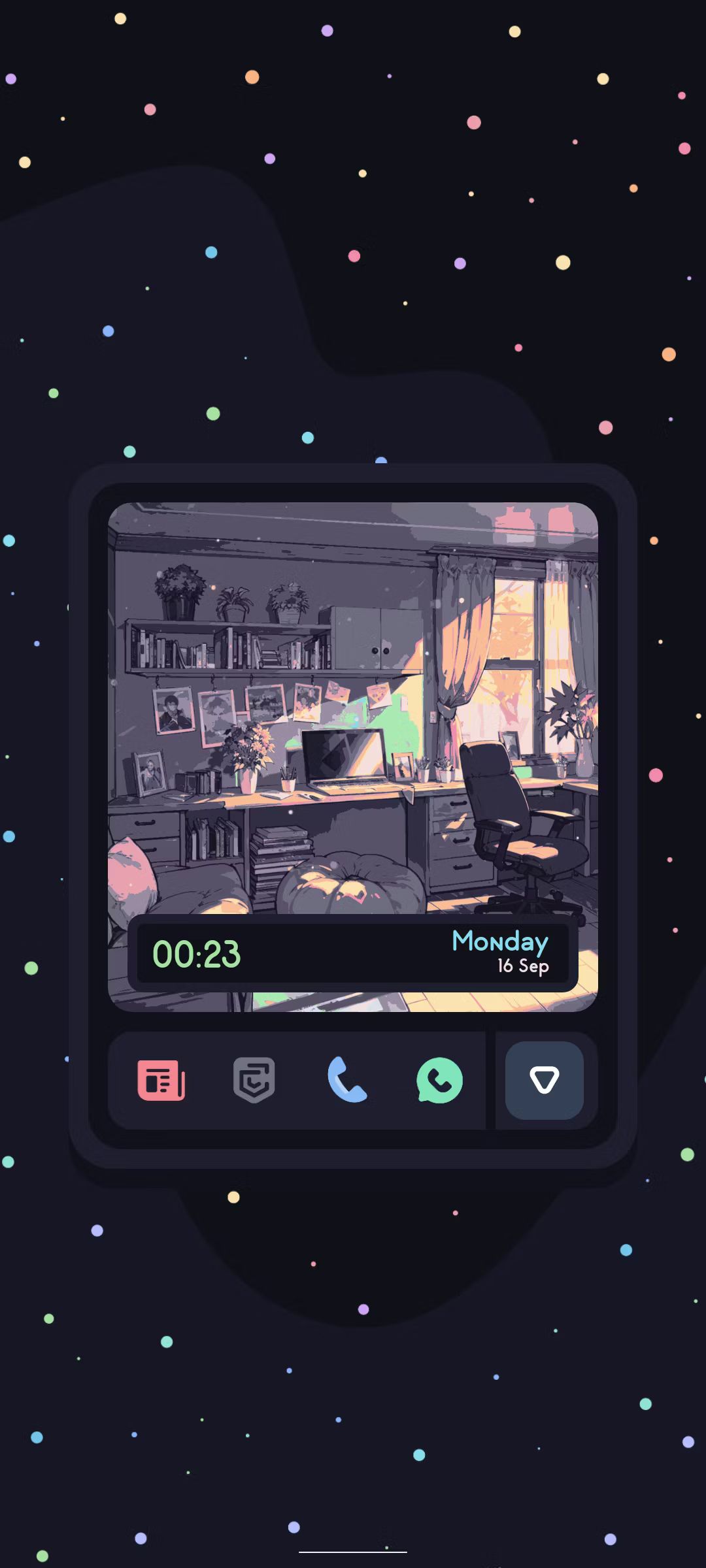
Pratik doesn’t reveal much about how this homescreen was created, keeping their cards close to their chest. And it’s hard to blame them; this is one of the best minimal screens to cross our path in ages. It leans on the design of Catppuccin, known for its soothing pastel theming properties. You can see the app drawer tab at the bottom, leaving easy access to all apps, which will be needed when you only have five apps on the screen. But the way those five apps are displayed, in the middle of the screen flanking a clock widget inside of chill drawing of a bedroom, all the while that box is floating in the middle of the screen, with colorful space dust surrounding it, there’s just something really relaxing about all of this. Not only is the homescreen striking, it encompasses the soothing properties of Catppuccin perfectly.
1 Making full use of limited space doesn’t always result in clutter
Szymon utilizes Nova Launcher and KWGT to perfection
Source: Szymon
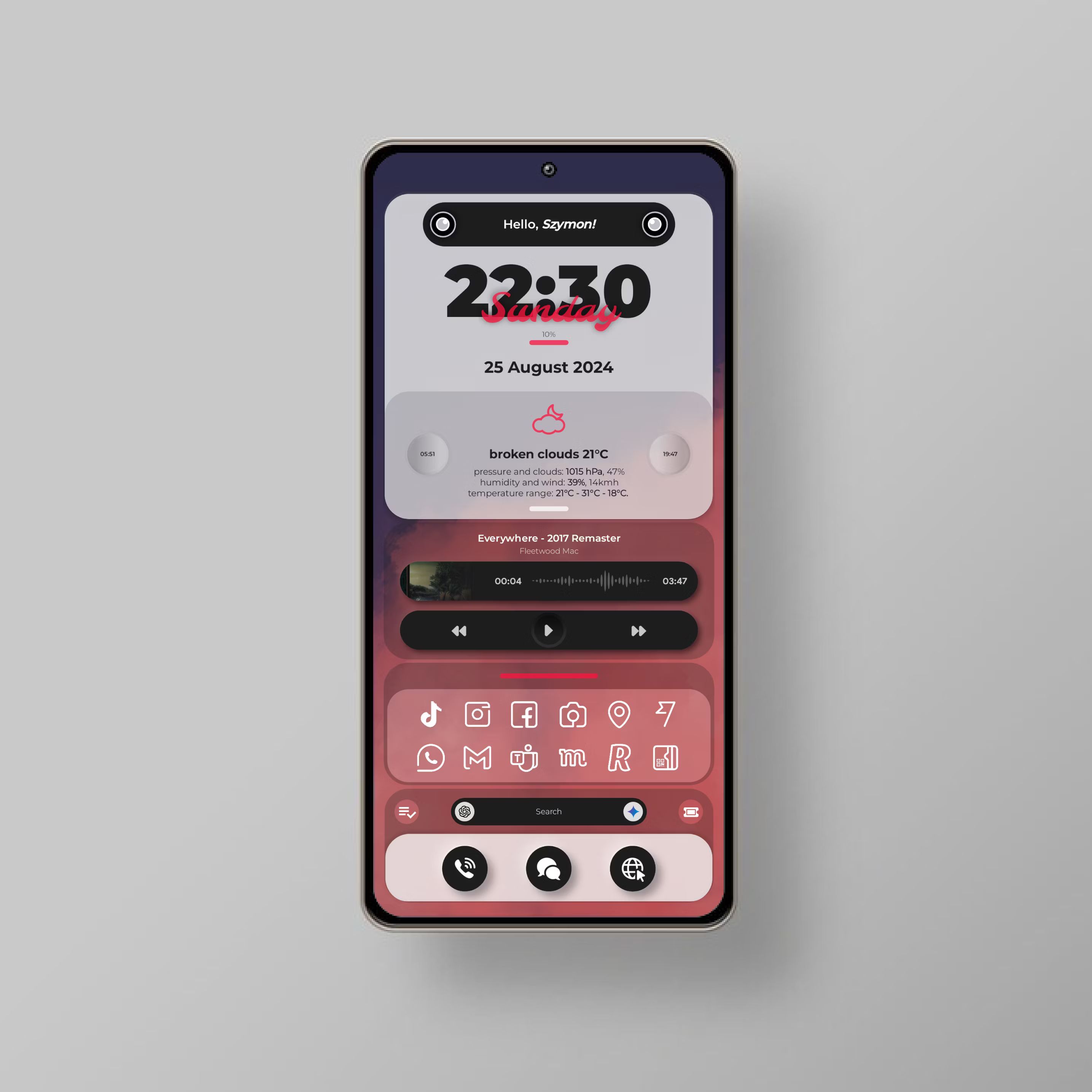
Just look at this homescreen; it’s absolute perfection. Reader Szymon pulled this off on a Galaxy S23 using Nova Launcher and a few customized KWGT widgets. That’s it, and the end result not only offers plenty of shortcuts to needed apps, but also includes widgets for music, weather, time, and search, all the basics one would expect of their homescreen but displayed in a way that is incredibly pleasing. Of course, hiding the nav/notification bars helps this theme lean into minimalism, but at the end of the day, this is a great use of limited real estate without compromising. Good work Szymon!
Homescreens are very personal, and yet we can’t help but show them off to everyone
Perhaps it’s something of a humble brag, showcasing our homescreens to the internet at large. It’s a trend we’ve certainly noticed over the past decade and a half; everyone loves to share how their homescreen looks. XDA’s forum used to be filled with people showing off, and clearly, our recent Clip that received hundreds and hundreds of replies also struck a cord. What’s incredibly thrilling about all of this is how different each screenshot can look, circling right back to how personal our homescreens are. They give us a chance to easily design something that says “this is me,” which is even better than our laptops and PCs, seeing we drag our phones with us everywhere. Theming is something Android excels at, and the user base fully embraces it, which is a big part of what makes Android so fun to use. So continue theming everyone and keep the good times rolling, and don’t forget to bring along some of the best icon packs.
Source link

