Summary
- Android 15 may introduce a color intensity slider for color-blind users, offering more customization options for an optimized experience.
- The new feature is not included in the Android 15 Beta 3.1 release, but it might land on Android devices with upcoming updates.
- By providing various color correction options and a visual demo chart, Android enhances usability for color-blind users, addressing different color vision deficiencies.
Different applications and tech gadgets are often designed to be usable by all people, regardless of their physical and health condition. Since Android 10, Google has added color correction settings to help those with color vision deficiencies see colors more accurately and enjoy their device without difficulties.

Related
Android 15 Beta 2 adds color contrast settings for Google’s dynamic Material You themes
It’s no longer a drawn out process to gain access to some valuable accessibility settings
Google’s continuous efforts to optimize Android for color-blind users could soon reach a new milestone by adding an intensity slider to the color correction settings page. This potential update, as spotted by Android expert Mishaal Rahman and reported by the Android Authority, promises new accessibility options for color-blind users.
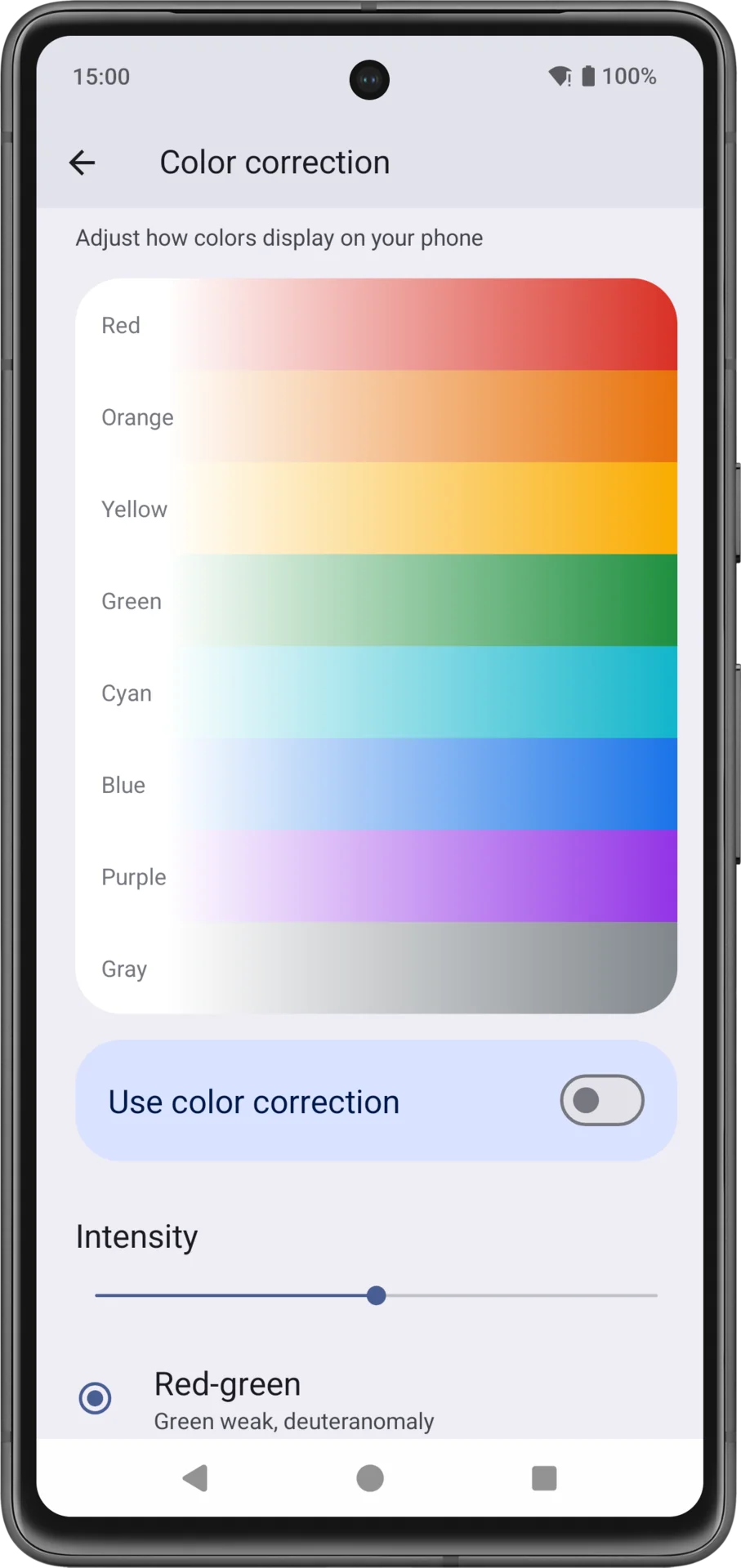
The slider, which ranges between low, medium, and high, will allow users to adjust the value and change the intensity of the color balance according to their condition. The feature is not yet available for the Android 15 Beta 3.1 release, but it might be included in the upcoming updates.
Android 15 color correction settings get more options for color-blind users
Android’s color correction settings, available under Settings > Accessibility > Color and motion, put the power in the hands of color-blind users. On this page, users can choose between four color corrections, including two red-green options for deuteranomaly and protanomaly, a blue-yellow for tritanomaly, and grayscale for those who can’t see any color. This level of control allows users to tailor their experience according to their needs.

These settings will ultimately help color-blind people better distinguish colors by tweaking the color balance across different Android apps. On the same color correction page, Google has also added a chart to demonstrate how each of those available options impacts different colors.
People with color vision deficiencies can distinguish only 20 hues or fewer, while others can distinguish over 100 hues of color. There are currently three types of color blindness worldwide. Fortunately, Google has added related settings for each of these conditions in Android color correction settings, and a potential enhancement that might be included in Android 15’s upcoming releases.
Source link


