Summary
- Google updates Android Auto with a new Assistant interface that gives off a bit of a Siri vibe.
- The new UI doesn’t replace the existing Assistant bar but adds a circular, animated interface that appears when Assistant is actively listening.
- This change has been spotted on Android Auto version 12.5 on a Galaxy Z Fold 6, but its widespread availability is still unknown.
Earlier this year, Google gave Android Auto a fresh update with a new Assistant interface that included a cool voice reply feature. Instead of the usual app icons, you now get a dynamic “listening” screen that visually responds to your voice, showing your spoken words right on the display. Now, Google has stepped it up again with an updated Assistant experience on Android Auto that’s got a bit of a Siri vibe.

Related
7 Android Auto settings you didn’t know you needed to change
Get more control over Android Auto with these setting changes
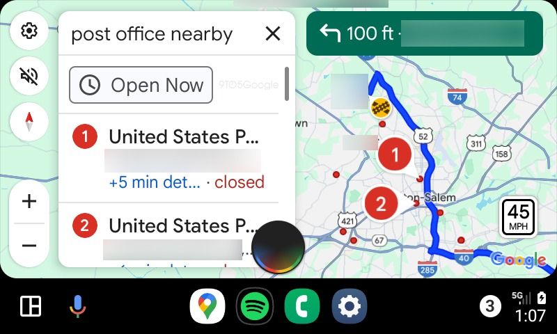
9to5Google reports that Google is bringing a new twist to the Google Assistant interface on Android Auto, which comes into play during voice interactions. This new look doesn’t replace the familiar Assistant bar at the bottom of the screen, which still works for starting commands. Instead, the new interface kicks in when Assistant is actively listening, like when it’s waiting for you to narrow down a search or pick a specific type of destination.
The updated UI features Google Assistant‘s signature four-color bar around the edges and takes up the lower third of the screen. It shows up as a circular capsule that fades away once it processes what you’ve said. Interestingly, it’s got a vibe similar to Siri on CarPlay, with both using a colorful, animated circle at the bottom during voice interactions. But Google puts its own twist on it with those unmistakable colors.
The new UI might not be everyone’s cup of tea
The new UI could take the Android Auto experience up a notch, making voice interactions feel smoother and more fun. The bright colors and cool animations might make Assistant seem more responsive. But if you’re a fan of the simple, clean style of the current bottom bar interface, you might find it a bit too much.
It’s not clear how widely this new UI is available yet, but 9to5Google spotted it on Android Auto version 12.5 running on a Samsung Galaxy Z Fold 6. Adding a new UI for Assistant in Android Auto makes you wonder if it’s needed with the digital assistant already on the bottom bar. Still, it definitely brings a fresh visual spark to the experience.
Source link


