Summary
- Android 12 introduced major visual changes with the new Material Design principles and dynamic theming, and Google recently updated the design of Material Design 3 progress bars and sliders.
- New design guidelines for progress bars include a stop indicator, gaps between the progress indicator and track, and rounded ends for the linear version.
- Sliders now have a centered configuration and straight line handles, instead of circular ones, along with rounded ends like the progress bars.
After years of updates focused on core functionality, Android 12 was the first update to bring major visual changes in recent years. It introduced us to Google’s new Material Design principles and dynamic theming where UI elements in apps and the Android system borrowed colors from the active wallpaper. Subsequent updates have polished the appearance to perfection, and we are still seeing small changes and updates along the sidelines. Google’s latest tweak revolves around progress bars and sliders.
The current generation of design guidelines for Android apps is known as Material Design 3 (MD3), and Google has dedicated an entire microsite to visual examples for app developers to understand how buttons, toggle switches, list items, etc. should appear. In December, Google announced changes to the visual design and color of both linear and circular progress bars in the Android 14 UI. Circular bars are preferred where there isn’t much space, while linear ones are the go-to choice when almost the entire width of the screen is available.
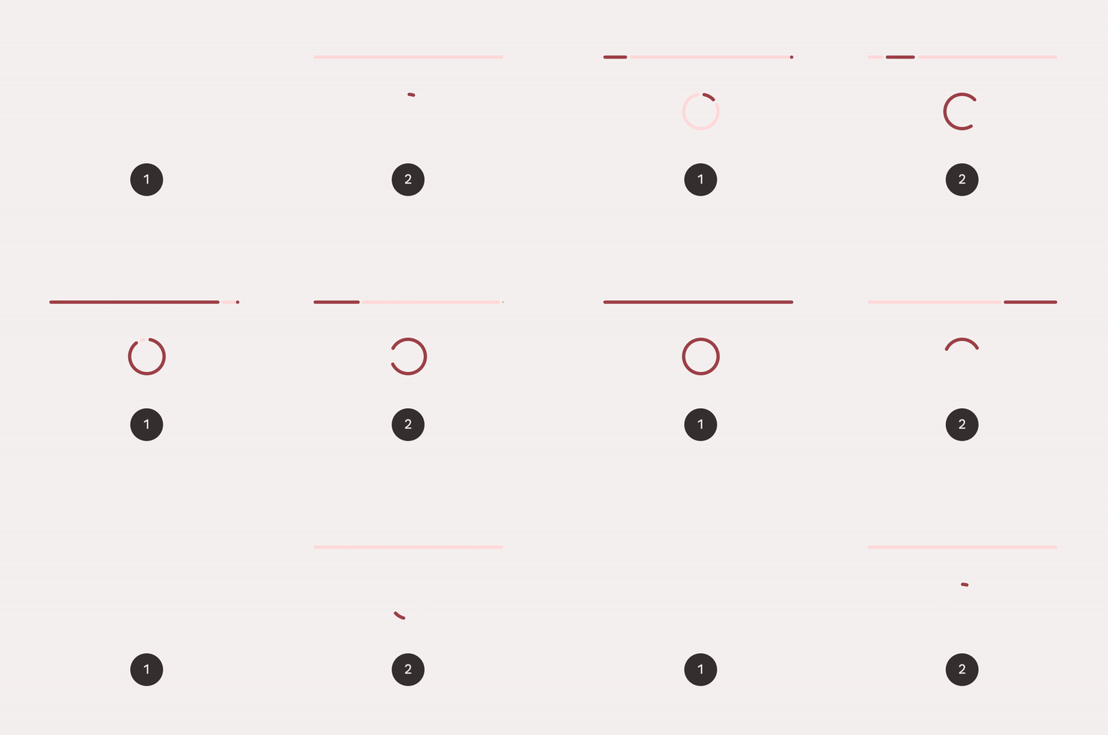
The old progress bar designs (left) compared to new ones (right)
First spotted by Dylan Roussel on X (formerly Twitter) (via 9to5Google), the new linear progress bar design features a stop indicator color-matched to the progress indicator, and a gap between the progress indicator and its track. The gap splits the progress bar into two — one indicating how much progress is made, and how much remains. The ends of the segments on either side of the gap are rounded off instead of sharing the boxy appearance with the MD2 bars.
The circular progress indicator has two such gaps — one in the 12 o’clock position where the track starts and ends, and another where the progress indicator is. The circular version doesn’t have a stop indicator, but shares rounded corners with the linear one.
Another anomaly is an indeterminate linear progress indicator, often found when downloading files of unknown size in Chrome. Here, MD3 loses the stop indicator and adds gaps on either side of the progress bar segment which slides from left to right on the track. Indeterminate circular progress indicators, like those found around app icons while Play Store apps wait for the download to start, have an invisible track and an arc which spins around.
Source: Google
Determinate progress bars (left); Indeterminate progress bars (right)
Google explains that a stop indicator enhances accessibility, and is a necessity if the track cannot stand out from the background by sheer contrast alone. The new track and active indicator designs enjoy dynamic theming like before, but feature a sharper contrast.
Responding to Roussel on X, Google Material Design team Senior Designer Dallas Barnes mentioned the design for sliders was also modified in December.
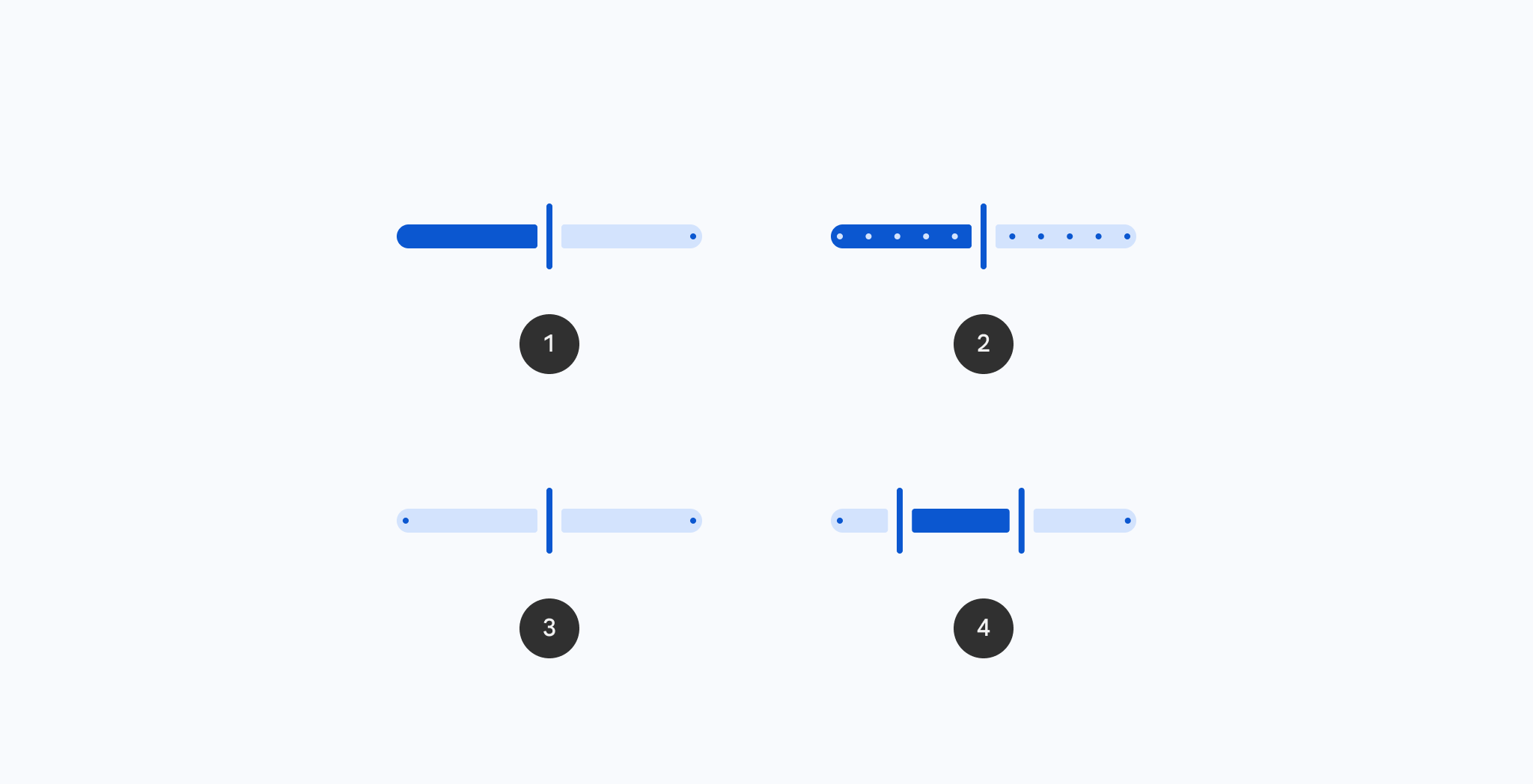
Sliders are used to adjust a parameter along a linear scale. Compared to MD2, the new design features a centered configuration like we see in photo editors, where the slider starts from the middle instead of either extremity, thus enabling positive and negative adjustment. Second, Google has rounded off the ends of the slider track. Handles used to make adjustments are now a straight line perpendicular to the track, instead of a circular dot.
Designs of various MD3 sliders
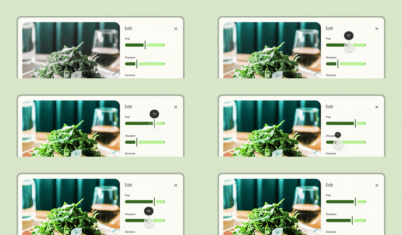
The slider handle is also designed to change when tapped or selected, slimming down and becoming taller, so you can see it around your finger when it is held down. If you slide the handle to either extremity, you will also notice the tracks adjusting their shape. A small dot may be visible at either end of some sliders to indicate their extreme values. Another design which only allows adjustment between predetermined stops (discrete slider) would feature evenly distributed dots along the slider track. Lastly, color mappings for sliders have also changed to enhance contrast and visibility.
Source: Google
MD3 Sliders in action
As we mentioned earlier, Google is still midway through an update making these new MD3 bars the standard across all its apps. However, you can see a few examples of the new design when you tap your profile picture in the Photos app or the Play Store. As for the new sliders, we must wait for an OS update to see the change in Android system settings. They aren’t visible in ordinary Google apps yet.
Source link


