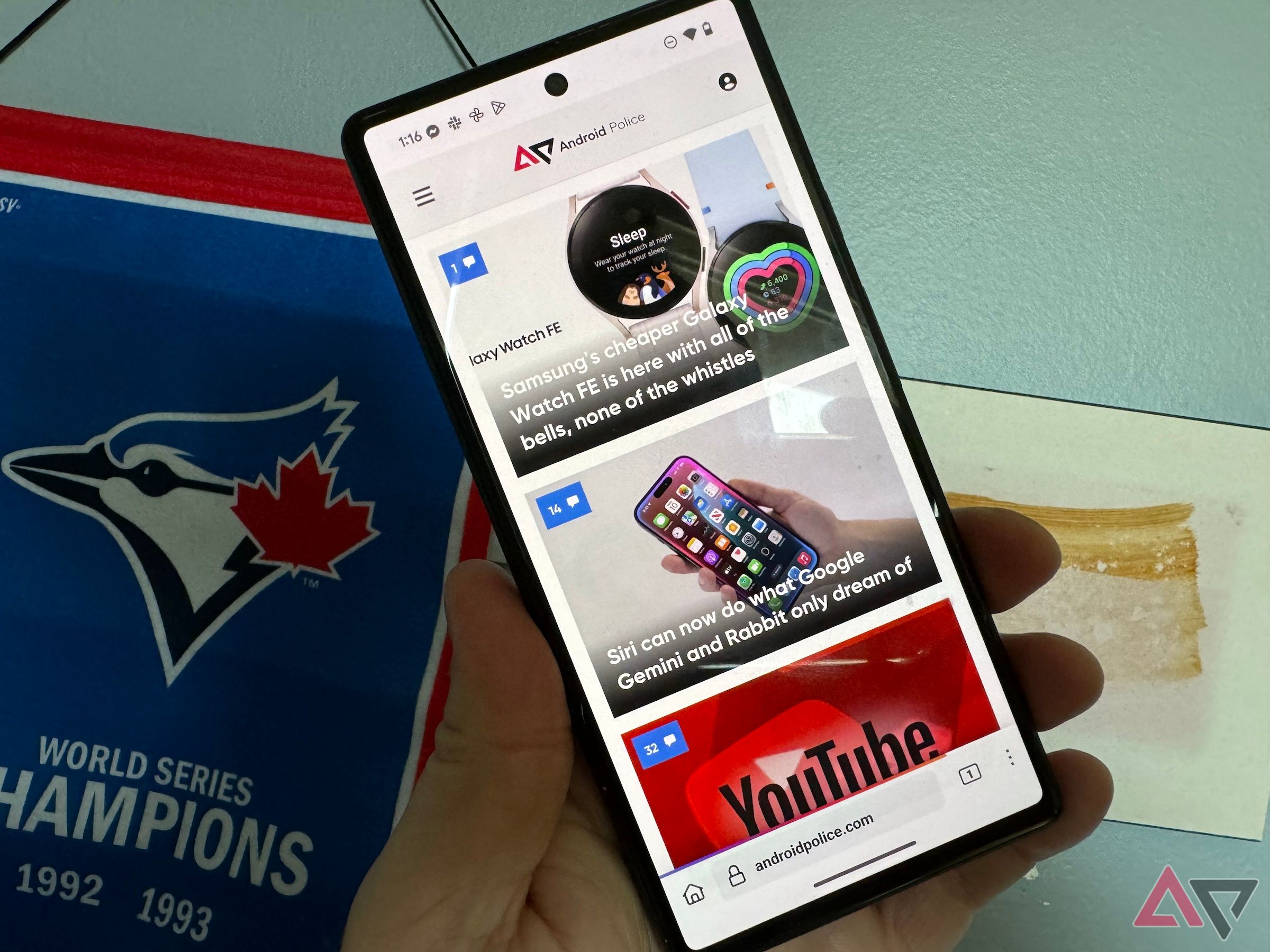
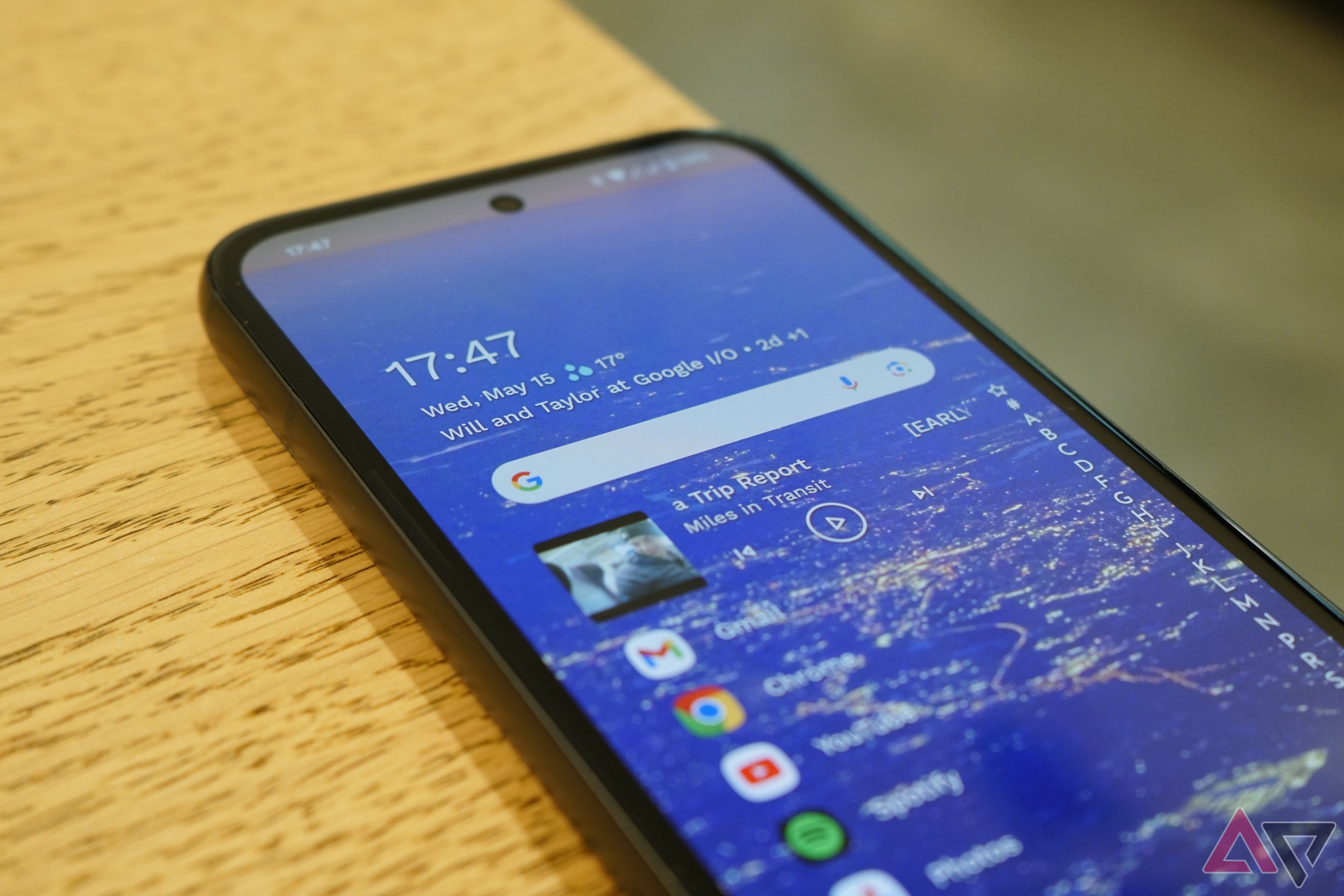
One of my biggest gripes when using my Pixel is the lack of bottom toolbars in Google apps. It makes scrolling through Chrome one-handed impossible without a lot of thumb stretching. Even then, my phone teeters precariously, leaning toward a smartphone disaster. I can’t be the only one who struggles with this. But one of the world’s biggest tech companies seems oblivious. Google can push the boundaries of artificial intelligence and cloud computing, yet it can’t give us a bottom toolbar.
This is a usability issue. Firefox has nailed the bottom toolbar. Even many of Samsung’s apps have it. Bottom toolbars are more ergonomic in this large device era. They make sense. What’s taking so long, Google?
Related
These are the Google Chrome features I can’t live without
Chrome is my digital command center and my home base
A history of inconsistent design
I wonder where the compose button will end up next
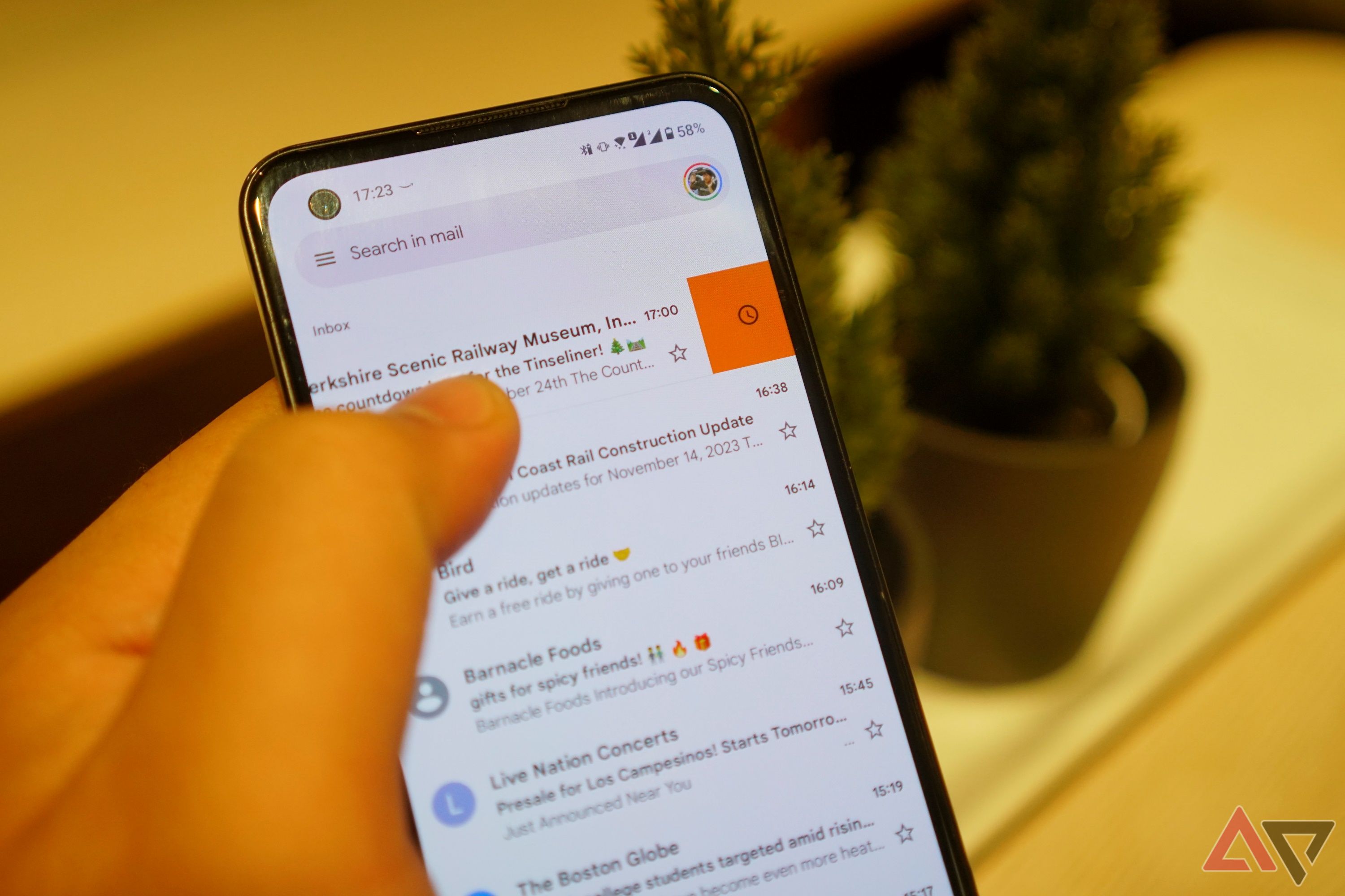
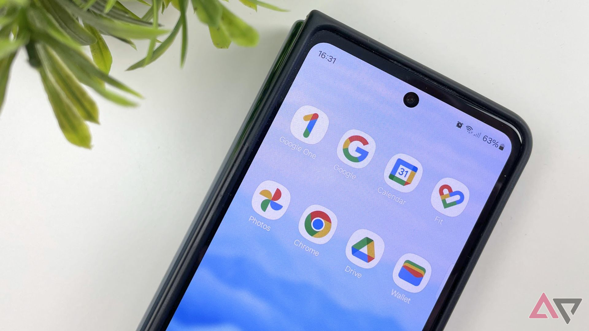
Do you remember the great icon purge of 2020? That was when Google changed most of its icons to the colorful symbols we have today. Yet, not all the icons were affected. Google Keep remained unchanged. Then there’s the Gmail “compose” button; it’s constantly being moved and redesigned. To give credit where it’s due, at least the compose button remains within thumb’s reach.
I have more examples if you want them. Google Drive is one. It regularly receives shiny new coats of paint and stays modern-looking. The app has had several facelifts over the years, on mobile, the web, and desktop. Google Calendar, meanwhile, retains the same dated design on mobile from when it first launched. The monthly animations in the agenda view are the same Material Design theme of 2014 and have not been updated to the newer Material You.
Related
6 apps we think Google could kill in the foreseeable future
These apps have big targets on their backs
These are a few examples of inconsistent design among Google’s apps, a trend that extends to their aversion to bottom toolbars. Thumb-friendly navigation remains missing.
Firefox proves bottom toolbars are better on mobile
But we’re not here to talk about design. The case for bottom toolbars is straightforward; it’s all about ergonomics. Most people hold their phones with one hand and use their thumb for app navigation. The average thumb can only reach about 40% of the screen. This means the sweet spot for tapping on menus and buttons is, you guessed it, the bottom of the screen.
Bottom toolbars are about more than convenience. They’re a key part of accessibility and safety. I’ve struggled while holding groceries or a squirmy toddler in one hand while quickly looking up something on my phone in the other. I’m sure you’ve been there. It’s nearly impossible to do with Chrome on Android. Yet other apps pull it off and yield a dramatic usability improvement.

Related
5 Firefox extensions for Android I can’t live without
These awesome Firefox extensions for Android can improve your experience exponentially
It’s not like Google has no one to learn from here. Firefox has had the option to move the toolbar to the bottom of the screen for ages. You can even prioritize your most-used functions for better accessibility. Samsung’s apps put everything on the bottom. Even Apple has fully embraced the bottom-of-the-screen life, with Safari, Notes, Calendar, and other apps putting their navigation buttons within easy reach. These apps prove that this design choice is feasible and preferable.
What’s holding Google back?
Bottom toolbars seem like a no-brainer
Placing the navigation buttons at the bottom of the screen is ergonomically preferable, and it’s feasible because plenty of other companies have already done it. So, what is holding Google back? Why is one of the world’s largest tech companies so resistant to implementing a clearly superior feature? There are a couple of possible answers.
First, Google may be coming around. The company announced it would release a limited option to move the Chrome navigation bar to the bottom of the screen on Android. Of course, it’s a clunky workaround that requires enabling some flags, which your average phone user won’t know the first thing about.
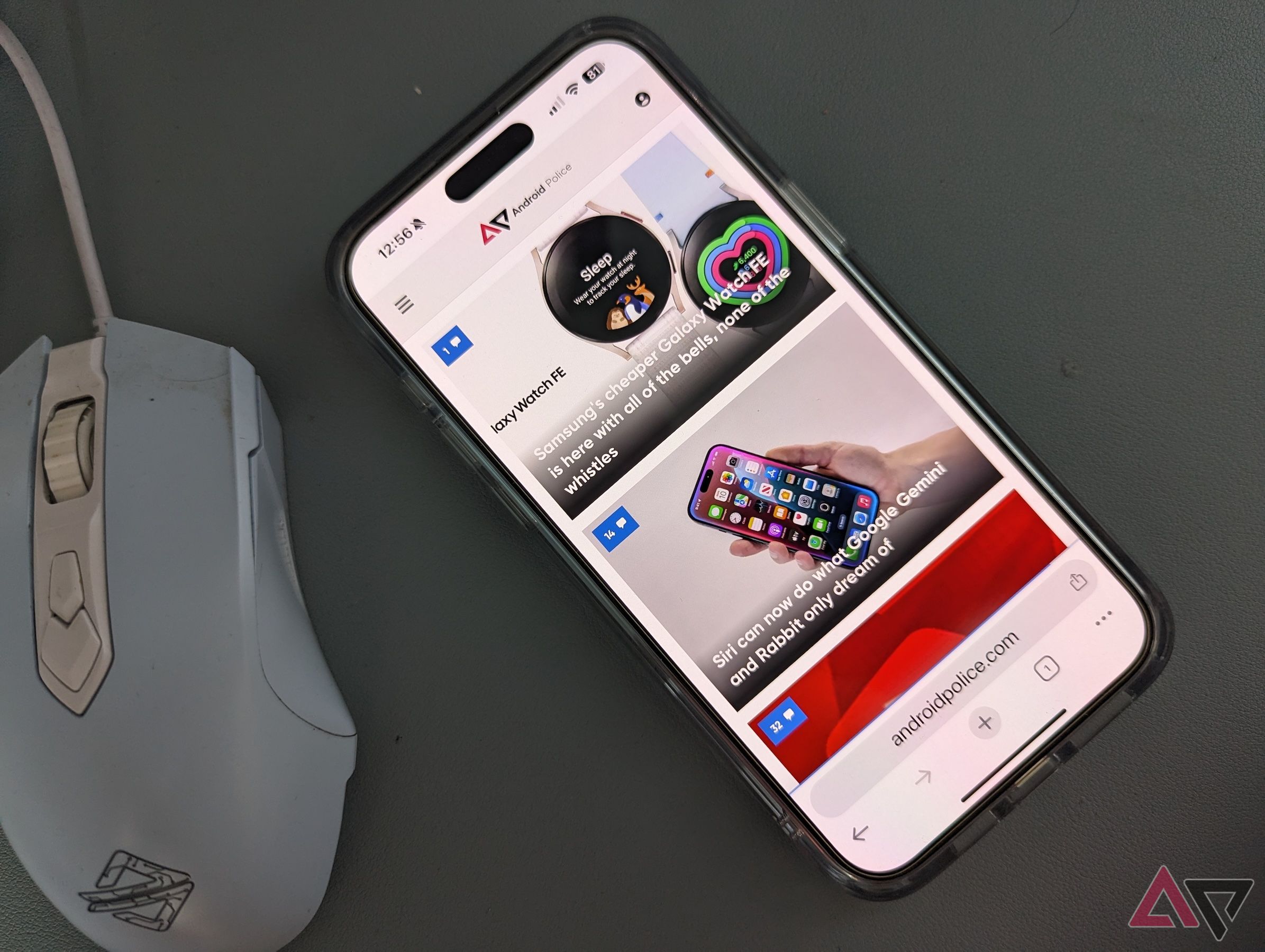
The most galling part of this is that Chrome on iOS already has a bottom navigation bar feature. We’ve joked more than a few times that Google apps on iPhone are often superior to Google apps on Android because good jokes are often couched in truth. The only reason we can think of for Google not bringing the same bottom navigation to Android is pure inertia. Large organizations grow resistant to change. After all, this isn’t your dad’s Google. There could be internal pushback from designers who have grown complacent with something that works for them. Legacy code could also be a factor.
Or perhaps Google’s priorities lie elsewhere. It considers itself an AI company now, not a web company. We still don’t know what that means for Chrome, but this could be one reason we haven’t seen a bottom toolbar on Android.
Maybe something will change in the future
Google isn’t the kind of company to sit still for long
Whatever the reason for Google’s reluctance to give us better one-handed use of our devices, the cost of inaction is clear. Firefox, Samsung, Apple, and many other app developers are pulling ahead, and Google risks appearing out of touch with the market. I realize that toolbar placement seems trivial in the grand scheme of things, but for me, it’s more important than any new AI gizmos the company can dream up.
After all, the benefits of a bottom navigation bar on my screen are undeniable. It’s more accessible for one-handed use and better suited to the way people actually use their Android phones. It’s time for Google to acknowledge this.
Source link

